Sizes, Formats & Frames
The Language of Proportion:
Not every image looks the same in every format. That's why we only offer our designs in the proportions for which they were created.
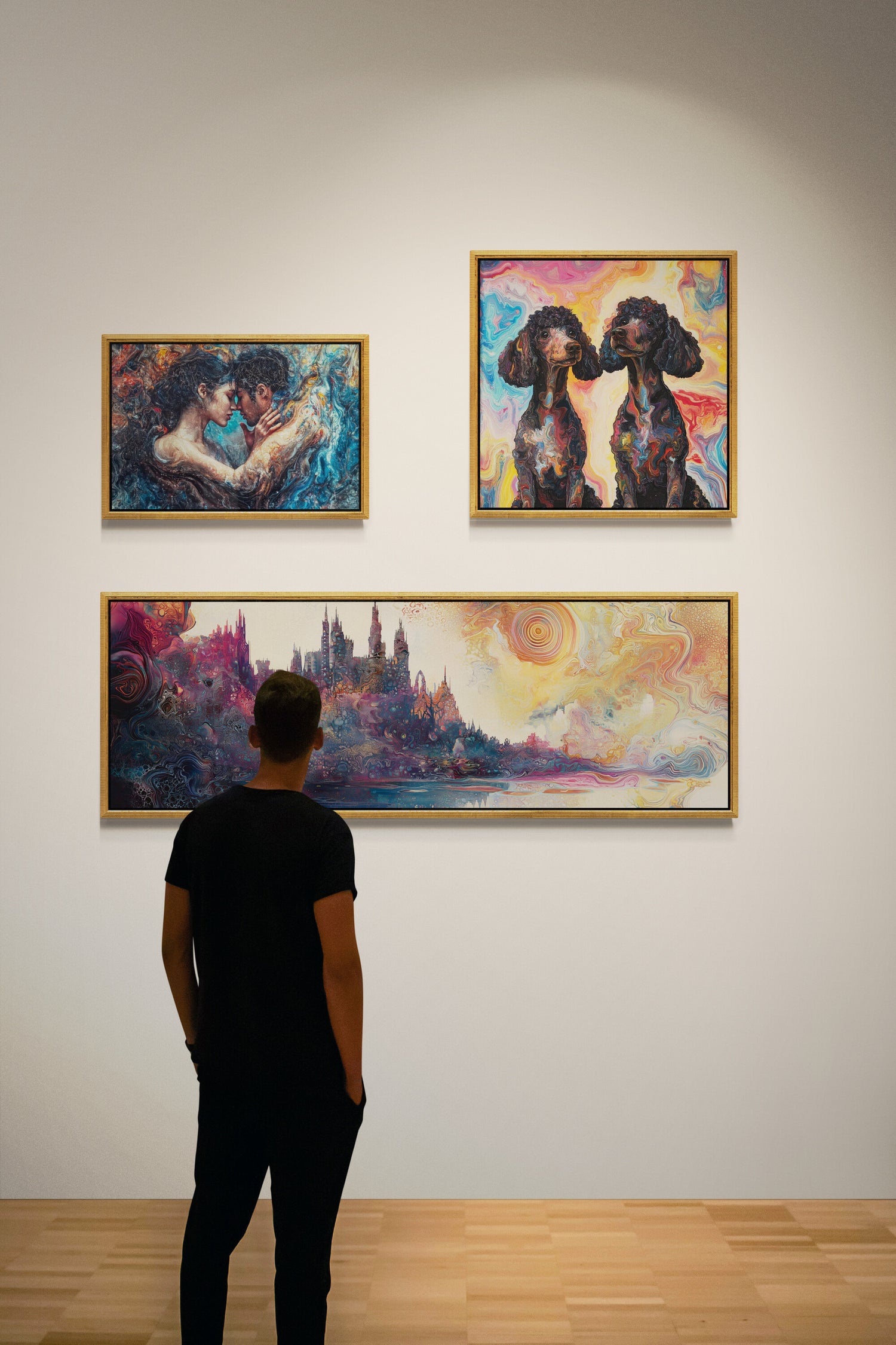
Square formats (1:1) appear calm, balanced, and harmonious. They are particularly suitable for areas where an image is intended to create a sense of order and balance.
Rectangular formats (2:3 or 3:2) are among the classic image proportions. They appear familiar, versatile, and fit into almost any interior design style. Many of our designs were developed specifically for this ratio.
Panoramic formats (1:3 or 3:1) create a sense of spaciousness and draw the eye across the room. They are ideal above sofas, sideboards, or beds. Vertical panoramas are also an interesting solution for narrow wall spaces, niches, or areas between windows and doors where conventional formats often appear too wide.
We do not alter the proportions of our images after the fact. An image is neither stretched nor cropped simply to fit a different format. This way, the composition is preserved as originally intended.
The choice of format is therefore not only a question of size, but also of its effect in the room.
Choosing the Right Size
The size of a picture determines its presence.
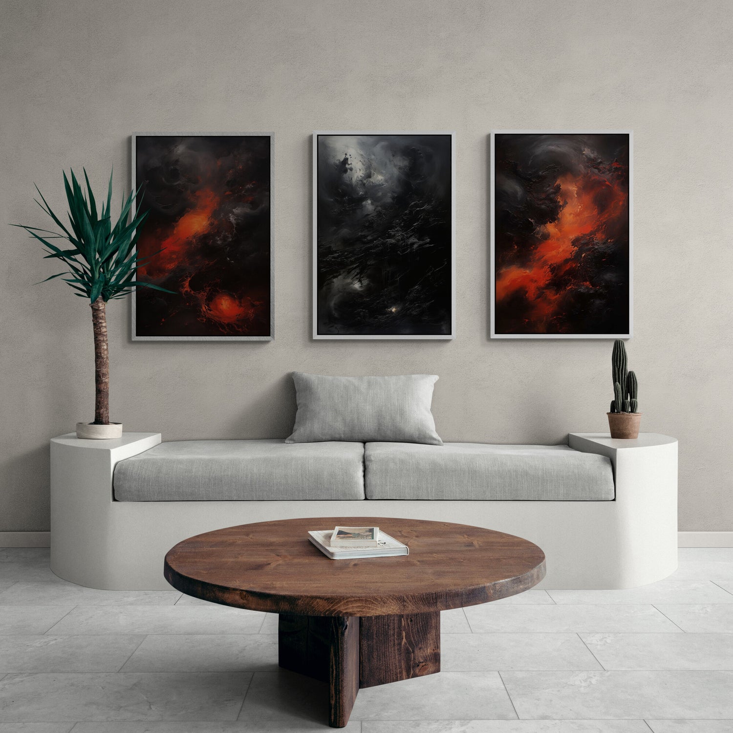
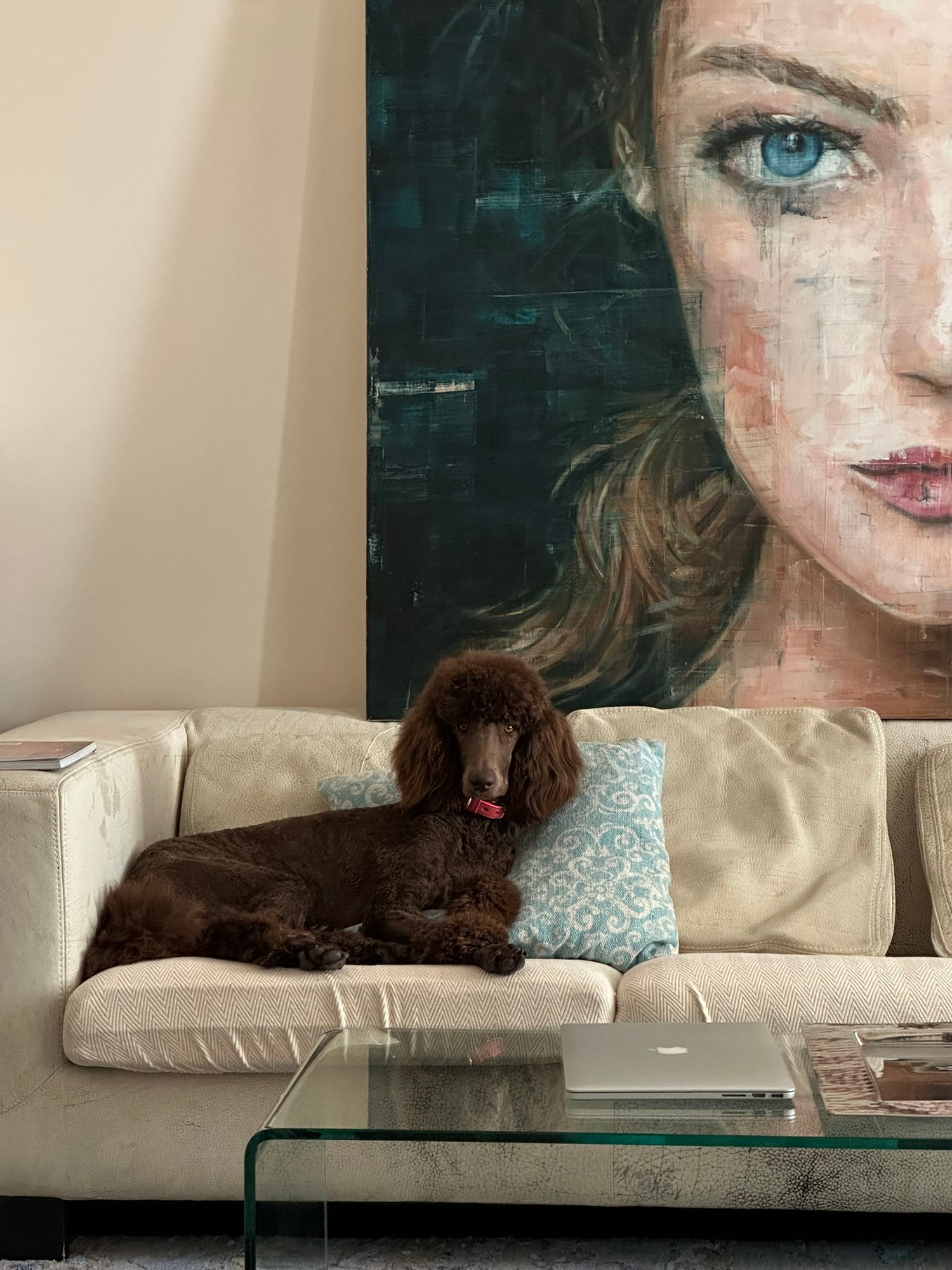
A large format often shapes a room more than any piece of furniture. Smaller pictures appear more understated and are particularly suitable for groups of pictures or smaller wall spaces.
I personally tend towards large pictures – those that make a statement on the wall. The largest work I own measures around 150 × 220 cm and hangs in the living room for good reason: it speaks to the others, and together they create a kind of dialogue in color.
Of course, you can also create gallery walls with smaller pictures – the interplay is what counts: theme, color, rhythm. Different formats can be mixed as long as they give each other space and remain in balance.
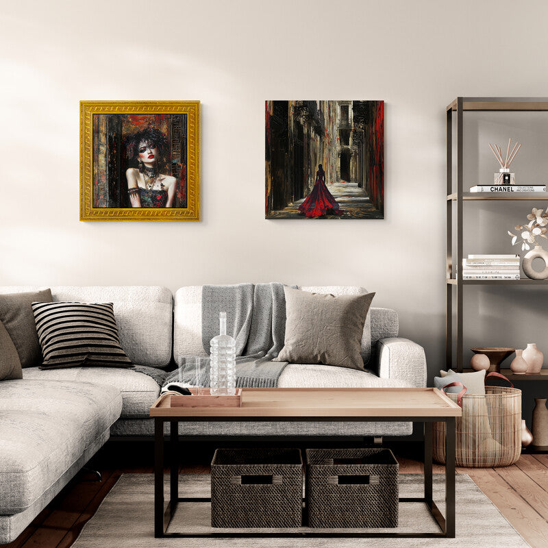
Framed or unframed?
A good frame not only protects the picture, but also determines how the artwork appears in the room.
That's why we offer all motifs both framed and unframed.
Unframed Paper prints are delivered rolled. This is the safest shipping method and gives you the freedom to decide on the frame and presentation later.
Our framed paper prints are placed in a high-quality box frame with lightweight and shatterproof plexiglass glazing. The result is a clean, modern look that reliably protects the print from dust and damage.
Canvas prints are always delivered stretched on a sturdy 38 mm stretcher frame. They can be hung immediately and already look high-quality and complete without an additional frame.
For an even more elegant presentation, you can choose a canvas with a shadow gap frame. This leaves a narrow gap of about seven millimeters between the picture and the frame. This makes the canvas appear to float within the frame, giving it additional depth and presence on the wall.
Ultimately, whether framed or unframed is a matter of personal taste. Some motifs are particularly effective with a clear frame, while others unfold their effect precisely through reduction to the essentials.
Passepartout – More Space for the Picture.
A passepartout creates space between the picture and the frame. This makes the artwork appear calmer, gives it more presence, and is particularly effective in larger formats.
The slightly beveled inner edge creates a subtle shadow line that adds depth and draws the eye to the main subject.
Many art lovers appreciate passepartouts because they give a picture more space and can enhance its impact on the wall.
Our passepartouts are in a neutral white tone and harmonize with all the frame colors we offer.
My conclusion:
Choosing the size, material, and frame is always a personal decision.
I have almost all of my artwork framed—except for the very large formats.
I usually choose the frame myself because it completes the piece like a period at the end of a sentence.
Of course, a high-quality frame costs money. It's not uncommon for it to be more expensive than the print itself. Nevertheless, I usually opt for one.
But then I have something on the wall that's twice as beautiful. Because in the end, it's not what the picture cost that counts, but how it looks on the wall.
And that's worth it to me.
Das passende Bild verdient den passenden Platz.
-
After the Feast
Regular price From €140,00 EURRegular price -
Another Bunnie
Regular price From €39,00 EURRegular price -
Apple Heart Kid
Regular price From €39,00 EURRegular price -
Blue Hat Beauty
Regular price From €39,00 EURRegular price


